
|
|
|
 |
 For no good reason, I gave myself a creative assignment. As most who consider themselves an artist would attest, it's important to create on the regular to keep that muscle exercised. The assignment I gave myself is to imagine a 8-team soccer league based entirely on fruit, with full logos and kits. As a result, the Fruit Cocktail League was born. Enjoy my nonsense. As before, I've added Designer's Notes to explain each look. Sporting Lime 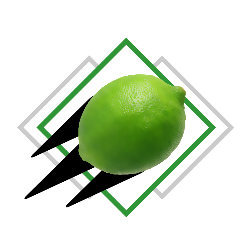 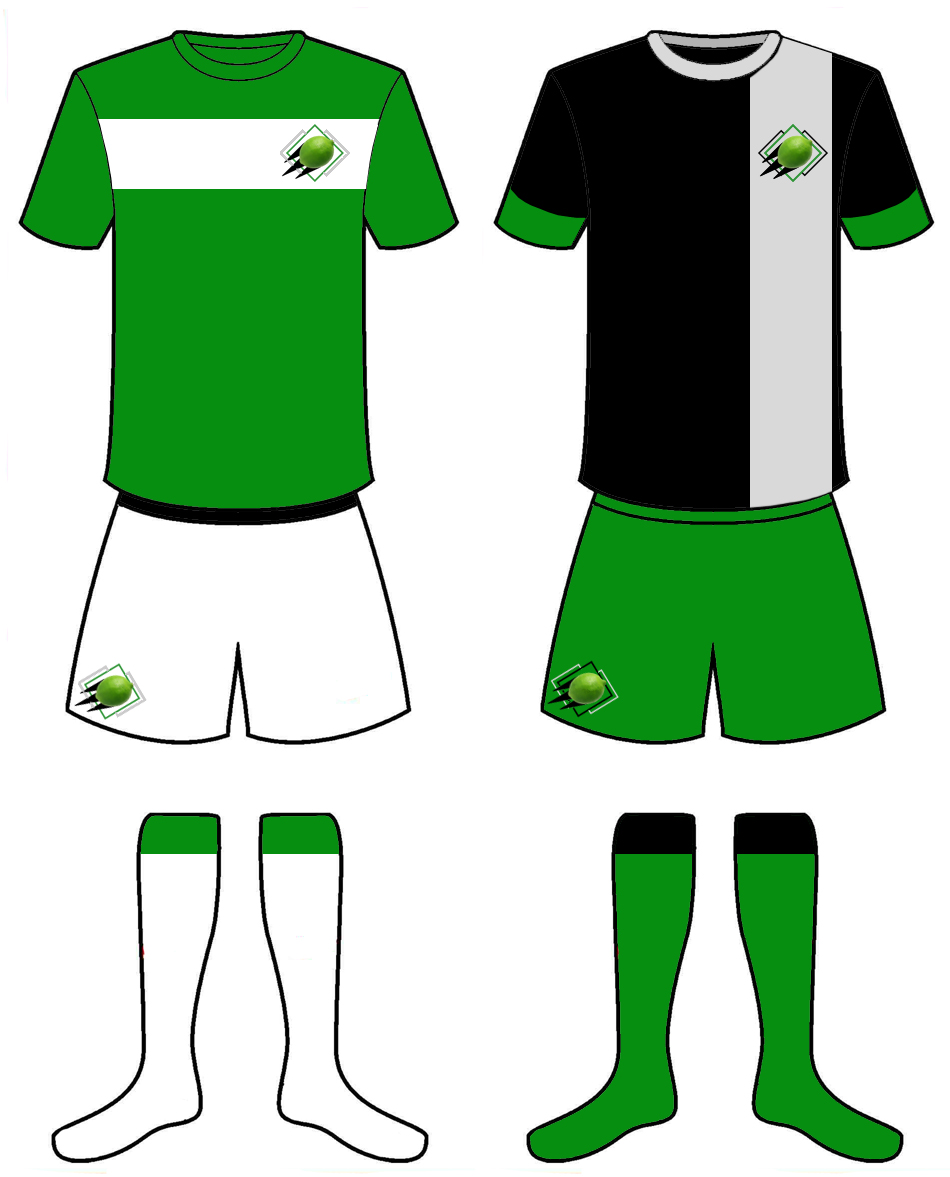 Designer's Notes: The name is inspired by teams like Sporting Lisbon and Sporting Kansas City. Limes have historically been accents or garnishes, and never really been the star of any show, so on the logo, the lime stands prominently. The black streaks give it an air of motion, which ties to the "sporting" moniker. Green was obvious for the home kit, but I deliberately avoiding white for the clash kit and went with black instead. The broad stripe on the shirts is a simple design choice that pairs nicely with the overall striping of the logo. Coconut Rovers 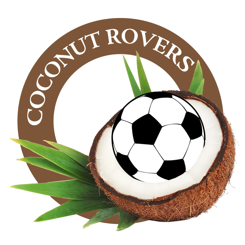 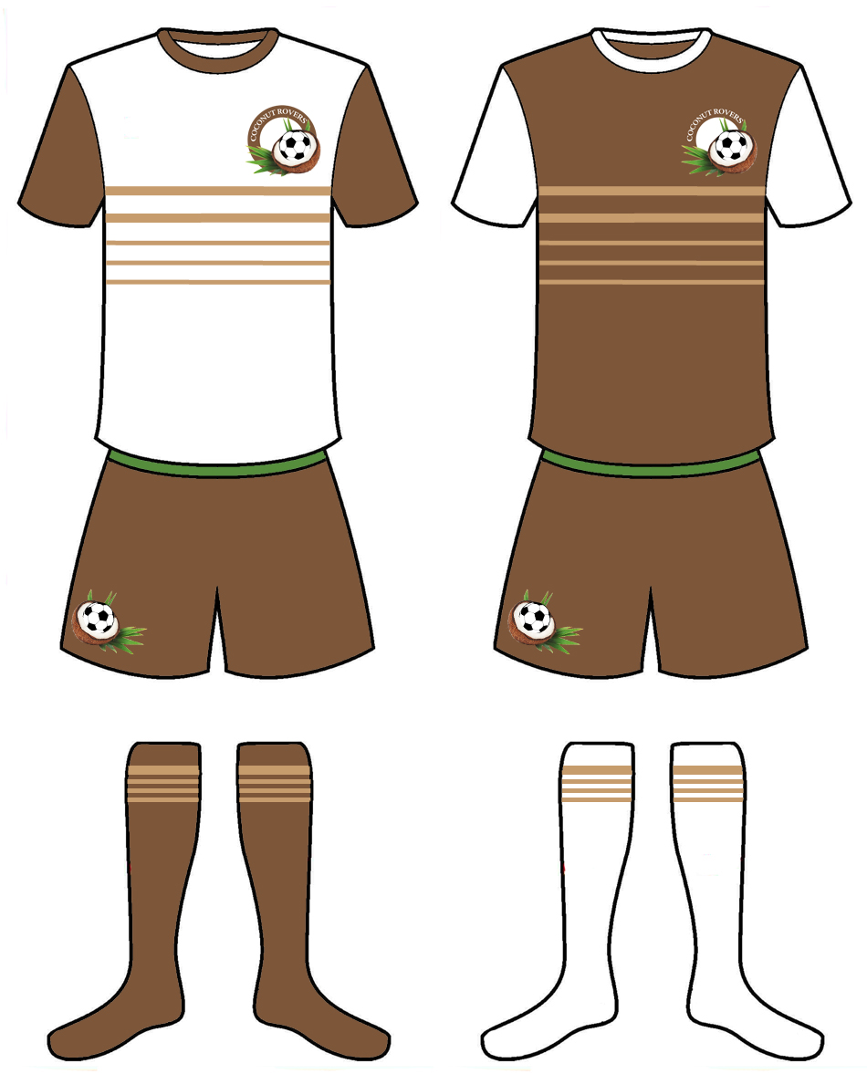 Designer's Notes: The name is inspired by teams like Blackburn Rovers and Shamrock Rovers FC. While I initially liked just the sound of "Coconut Rovers," it's also a well-known fact that coconuts travel. Both naturally in the ocean from island to island, and by post with just a stamp on it (seriously, look it up). The home jersey is supposed to represent a coconut cross section, with the white torso being the meat and brown sleeves and shorts being the outer husk. For the away jersey, I just reversed the torso/sleeve colors. However, the more I looked at the it, the more brown it got. I added the beige chest stripes to break up the brown, and the look really popped. I brought the beige stripes to the home kit, which gave it a finished look. Lastly, I put those stripes on the socks to tie to whole look together. Honeycrisp & Gala 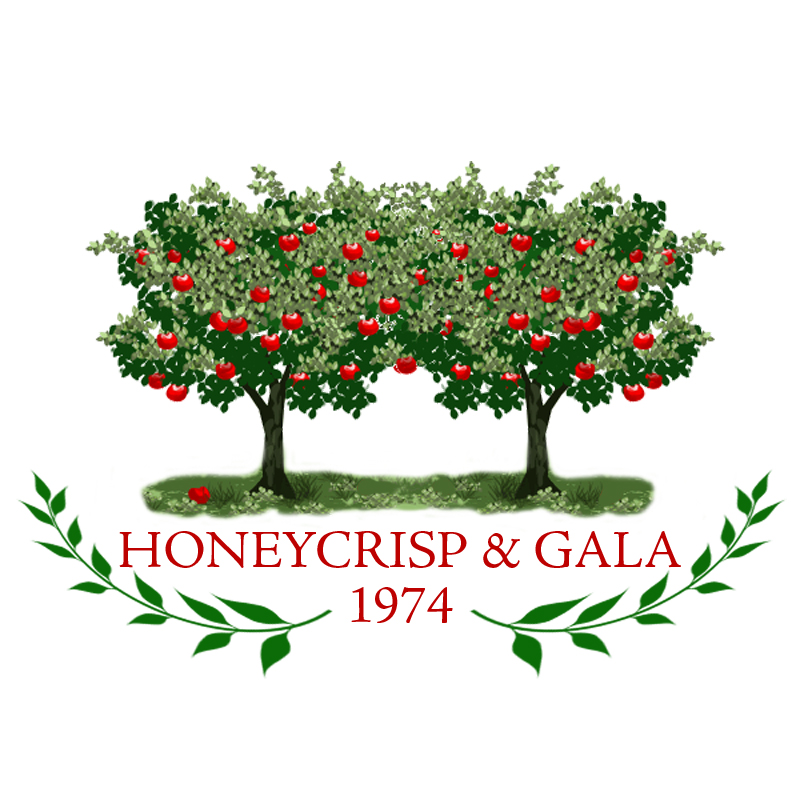 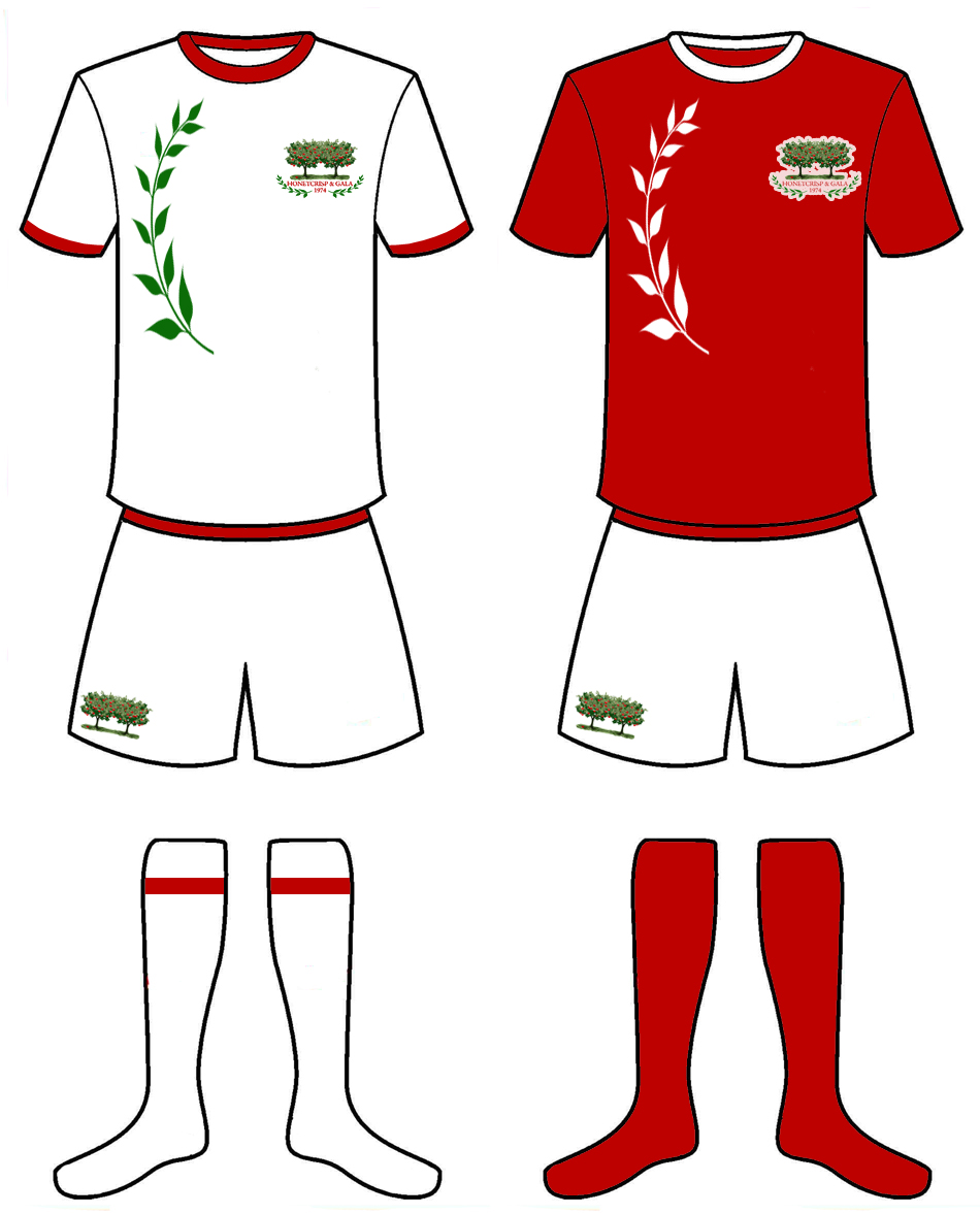 Designer's Notes: Apples are represented by Honeycrisp and Gala. Instead of some apple pun, the team name was inspired by English teams like Brighton & Hove Albion, but with varieties of apples instead. The two trees in the logo are supposed to represent the two varieties. The English theme carried over to the kits as well, as the England national team wears all white at home. The idea was to give the brand a more traditional feel. With that said, the all white look seems almost too boring, so I pulled a laurel from the logo, and graced the side of the shirt with it to add that bit of modernity, while honoring "tradition." For the away jersey, I went with apple red, because... apples, but kept the shorts the traditional white. Watermelon Wanderers Football Club 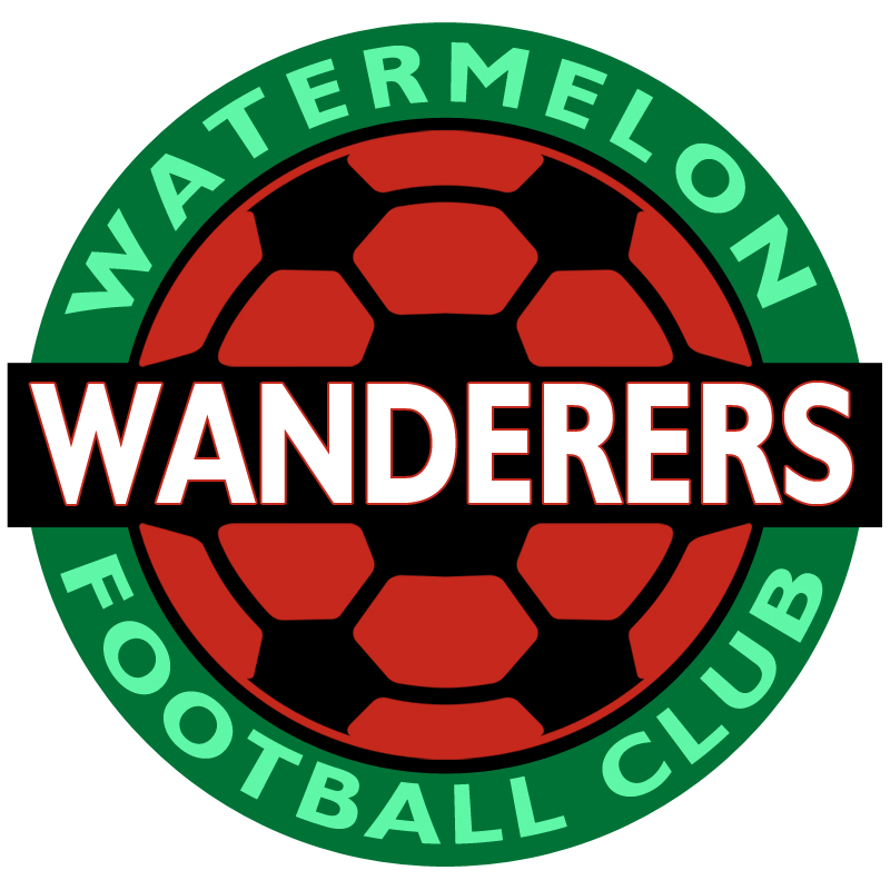 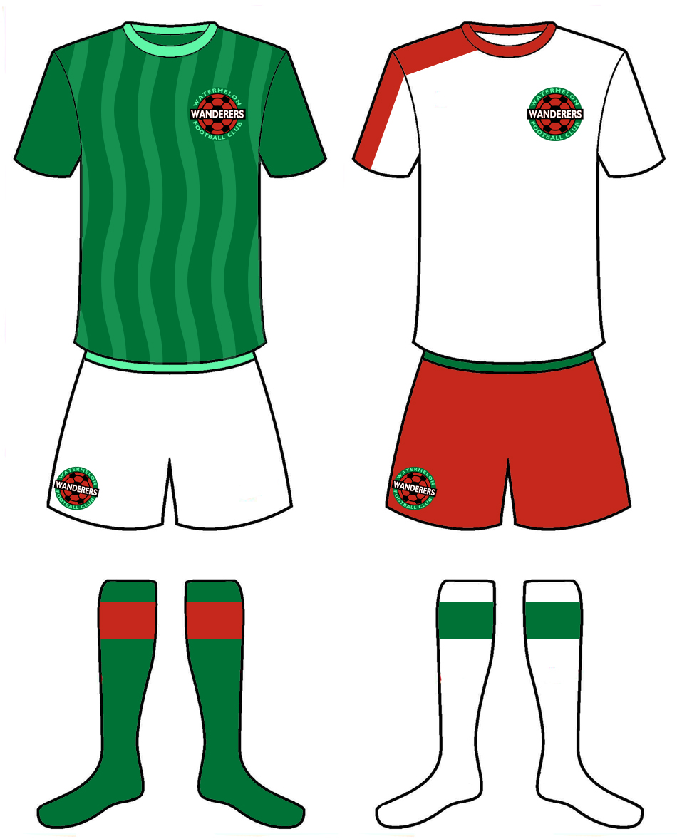 Designer's Notes: If we're being honest, this was the seed (no pun intended) for the whole project. Based on the team Wolverhampton Wanderers, the alliteration with watermelon and the idea of using soccer ball patches as seeds in the cross-section of a melon bore creative fruit (pun partially intended). It's because of this idea that a whole league was born. As watermelons are green with green stripes, it was an easy choice to replicate that on the home jersey. I made the stripes wavy to play into the "wanderer" vibe. I made red the highlight color on the away kit (that is mostly absent of green). The shoulder stripe is featured on the away kit (I've mentioned elsewhere I love that design element), but I am only using one shoulder to create an asymmetrical look. Cherry United  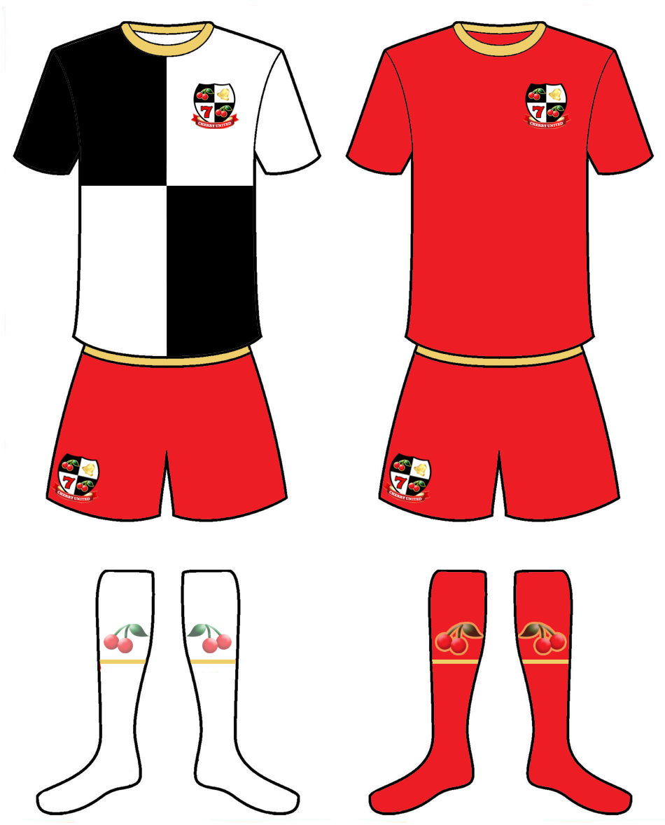 Designer's Notes: Every league needs at least one United team. For the Fruit Cocktail League, it's Cherry United. I wanted to use a shield/coat of arms for this team for no other reason than I felt the United team could pull it off. I tried to think what else can be associated with cherries to round out the logo, and I landed on old-time slot machines, hence the 7 and the bell. The home kit is a very bold choice, as it references the shield from the logo. But fans of Bristol Rovers are used to a blue and white version of this design, so it's not completely outrageous. The away jersey was made cherry red from top to bottom. I toyed with the idea of black shorts, but it was too Manchester United looking and came across as more plagiarism than homage. I added cherries to the socks for maximum cherry in the overall look. Lemon City 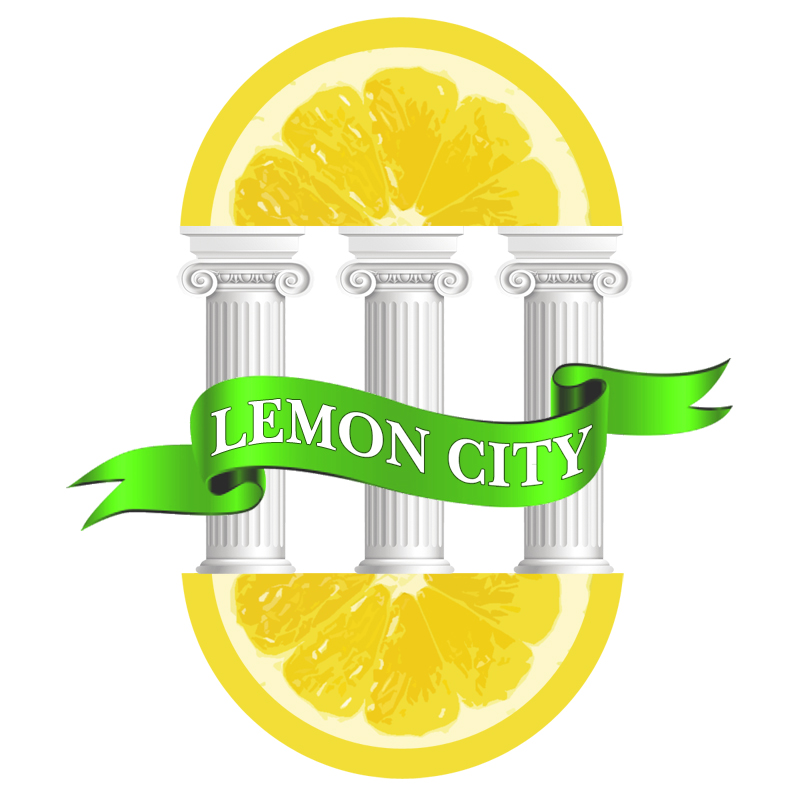 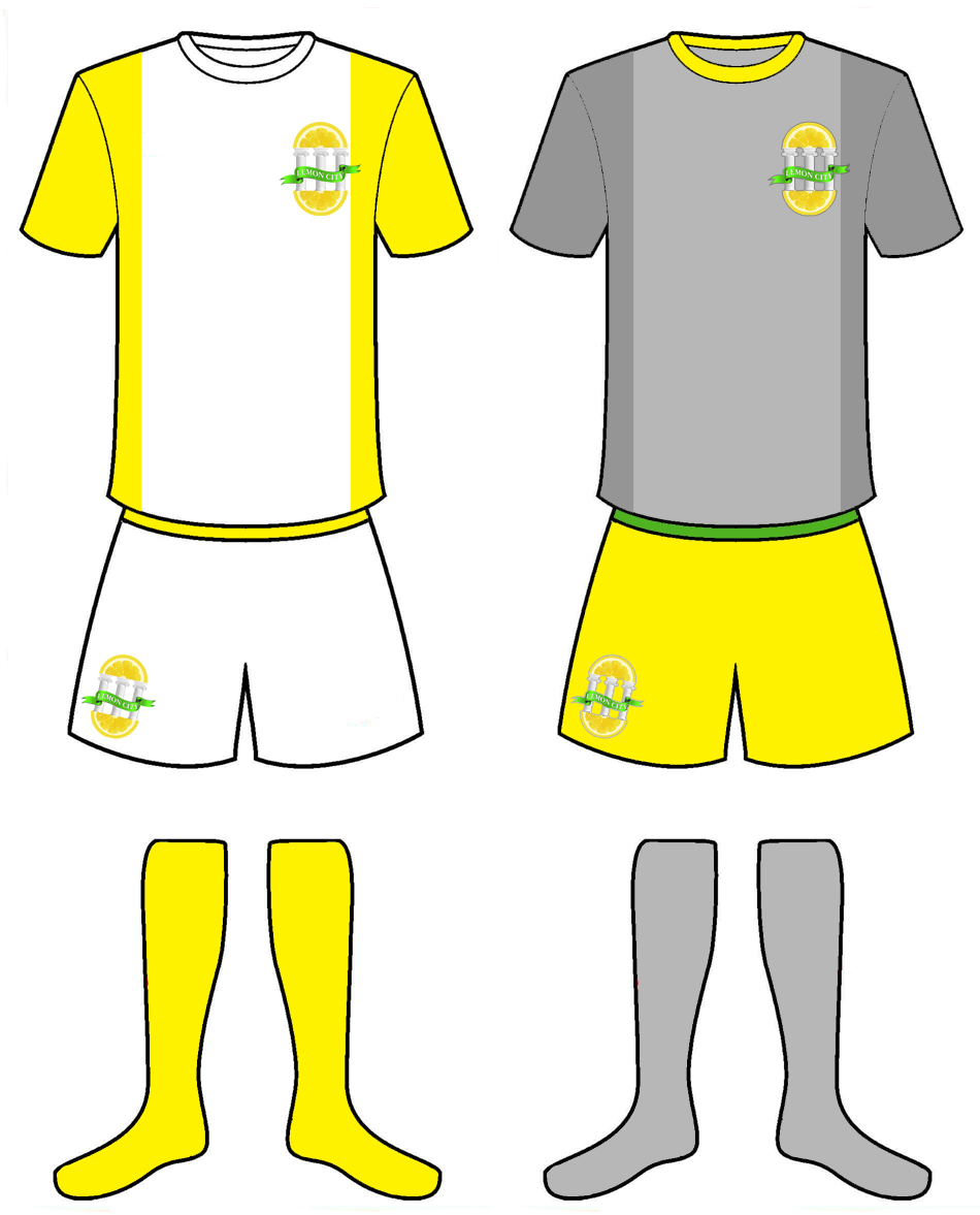 Designer's Notes: From the logo to the kits, this team gave me absolute creative fits. Inspired by teams like Manchester City and Hull City AFC, I paired Lemon and City without rhyme or reason. Eventually, the logo was inspired by a symbol used on historic cemeteries in Miami, Florida, which used to have a neighborhood called Lemon City (that symbol is a pediment supported by palm trees, so I swapped it for this by having a lemon supported by columns. I added the bottom lemon to balance it out. Sometimes design isn't easy). Whenever I need a creative crutch, I fall back on the Arsenal kit of the last 90's with the off-color sleeves and side panels (my all-time favorite look). I tried the white sleeves first, but the white core with yellow on the sides worked infinitely better. The away jersey is something I also struggled with until, on a whim, I added a second grey. Then everything feel into place. I could have gone with a green clash kit, but with two other teams using green primarily, and no one using a grey jersey, I went with the shades of grey (not quite fifty, but equally as uncomfortable). Tangerine Football Club  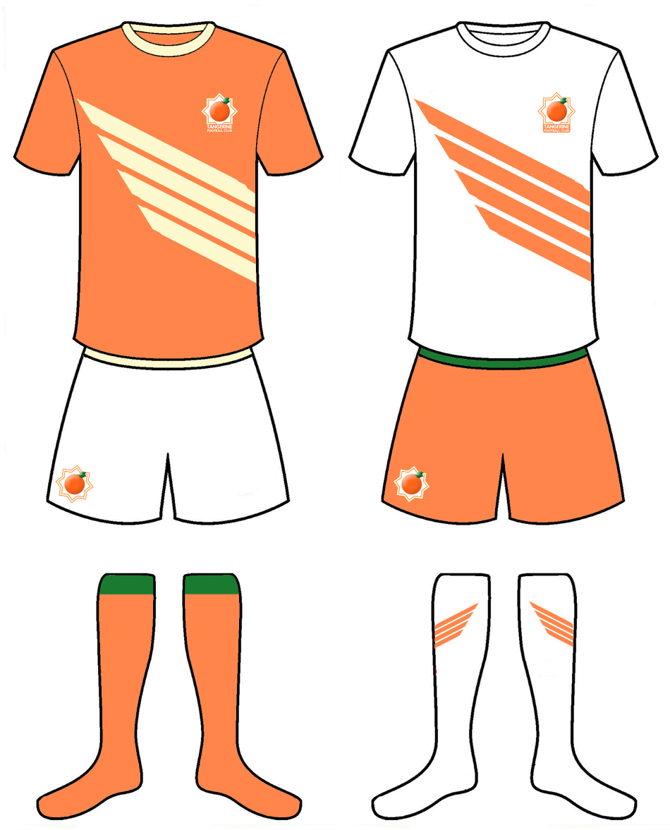 Designer's Notes: Instead of Orange FC, I chose Tangerine FC, because tangerines just don't get enough love. And tangerines are distinctively a fruit, whereas orange can be just a color (ask Syracuse University). The logo was purposely simple with the tangerine in the middle and the festive outer border radiating allusions to the sun. Focus groups really enjoy this overall look (ok, not groups, but the three people who saw it before posting, loved it.). The kits were also real easy. Orange top, white shorts, orange socks for home; the inverse of that for away. What's with the stripes? Good question. I was just dabbling with some ideas, and the next thing you know, this wing/sun-ray design popped onto the shirt. No branding story, no marketing jargon, just click, click, click, oooh, I like it. Bartlett South End  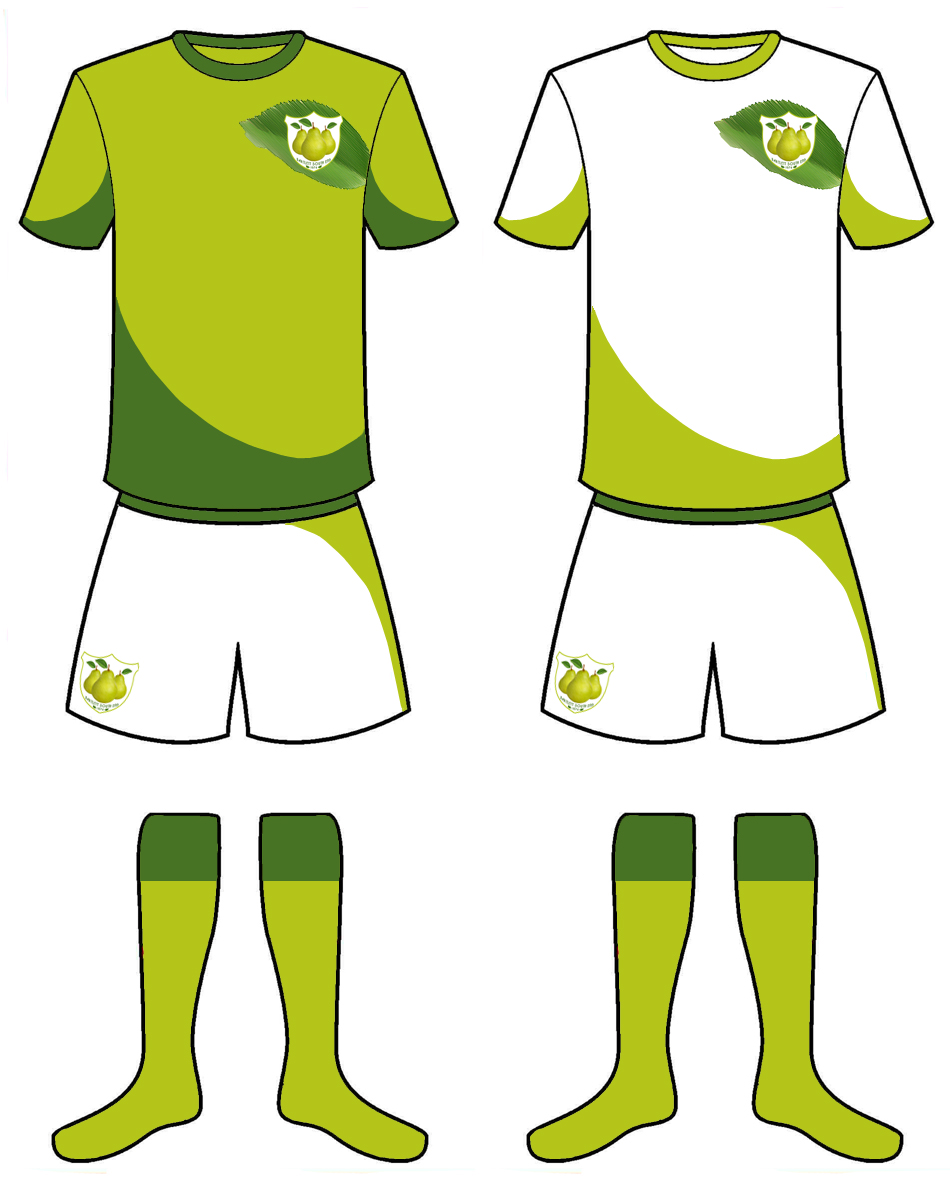 Designer's Notes: I toyed with a different fruit before landing on pears. I wanted another team that didn't directly name the fruit. Bartlett is the most common variety of pear, and Bartlett South End was born. The team name was inspired by the English team Preston North End, but went South as the bulk of the fruit is on the bottom (the "southern end"). As the name is an old-timey throwback, I went with a very old-timey looking logo with just the fruit in a shield. Much like Honeycrisp & Gala, to convey that traditional vibe, I added their first year of existence in the logo (1974 is my birth year) The two greens really make this kit sing because it plays off the colors of a pear without beating you over the head with it. They swooping accents are meant to convey the curviness of the pear. While this was the last one done for this project, it may be my favorite. Original post: May 7, 2020 |
 Thanks for visiting. Love, Demosthenes Spiropoulos |