|
|
|
 |
 I've designed sports jerseys for many moons. Sports and design is like chocolate and peanut butter... delicious. However, it was when a group of friends at work and I started doing fantasy sports together, that I flexed some extra (and wholly unnecessary) creative muscle. It was not just constructing a winning team, you should look good doing it. Longtime visitors of my site have seen these before, but I have added some extra Designer's Notes to explain my thought process (it'll be messy).
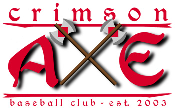
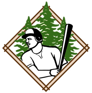
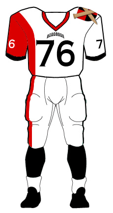
Designer's Notes: Get ready for a journey here. First, the League logo is also something I created. The player is a stock image I found from the internet, but the trees and the diamond were pulled/inspired by our workplace branding (if you know, you know). As for the team name, it came to me in a dream. Sort of. In my dream, "Crimson Cutters" was the name of a unit in the British army. I woke up thinking that was a cool name. I was going to go with that, but I was also bobbing around the name "The Axe." Naturally, I put it to a vote. Axe was the clear winner, but I added Crimson to it, because I felt it bumped it up a notch. And the Crimson Axe was born. Using crossed axes for form an X seemed like creative gift so I ran with it. 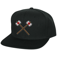 Crimson Axe home cap 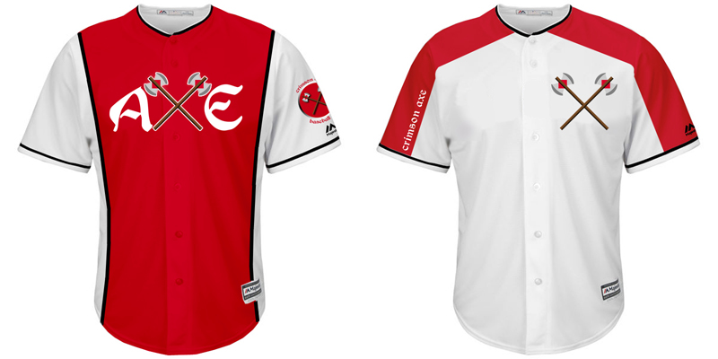 Crimson Axe home jerseys: Primary "Reds" and Sunday Alternates 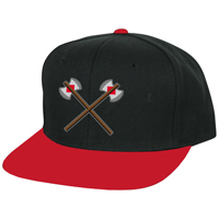 Crimson Axe away cap 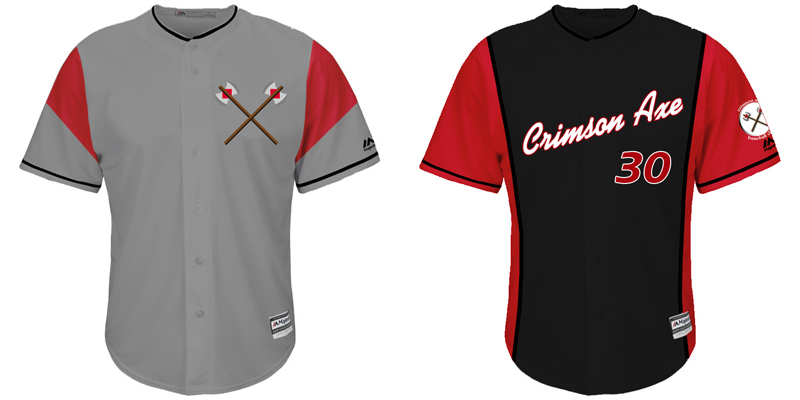 Crimson Axe away jerseys: Primary and Alternate "Weekenders"
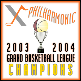
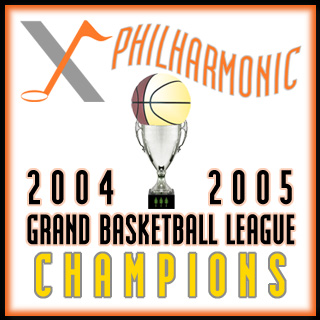
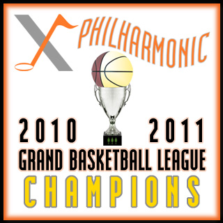
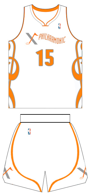
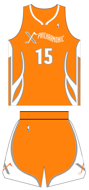
Designer's Notes: When I signed up for the basketball league, I had just put X as the team name as a placeholder. Some guys thought I should just leave it as such, but I wanted something with more flair. I had played on a club team called the Symphony All-Stars, and I liked that musical aspect. On a whim, I changed the team name to X-Philharmonic and it stuck. Obviously, the Utah Jazz feature a music note in their logo, so I made sure to make my note look like a real music note, and not a basketball with a flag. The wordmark is supposed to evoke music wafting in the air, and as for orange and grey as colors... well, that color combo just hit me at that moment and I fell in love with it.
Designer's Notes: The side paneling are more than just fun designs. Musicians can easily spot that the home white jersey features a treble clef (yes, upside down), and road orange jersey features a sixteenth note (also inverted). It is those subtle musical nods that really elevate the look. Throughout the years, there were a couple of different alternate looks, but in a case of addition by subtraction, I trimmed it down to this two uni set, and I think they stand excellently on their own.
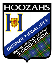

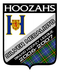

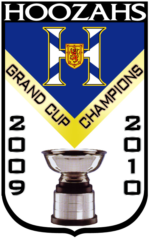
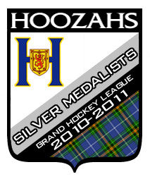
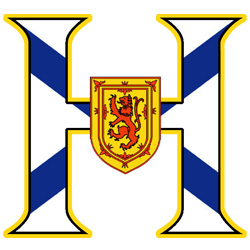
Designer's Notes: Your first question is undoubtedly, "What's a Hoozah?" It's just a made up word. And it came by listening to a little Dean Martin. Track 11 on the CD, "The Best of Dean Martin," is "On an Evening in Roma." In the first part, there is an organ featured, and it sounds like an organ you'd hear at an old-timey hockey rink during games. So when that part came up, I blurted out, "Ladies and gentlemen, now taking the ice, your Halifax Hooooooooozzzzahs! My wife asked, "The Halifax what?" Me: "Not the What. The Hoozahs." Her: "What the hell is a Hoozah?" Me: "They are all over Nova Scotia." Her: "I don't believe you." The logo is simply a mashup of an H, and the flag of Nova Scotia, which features a blue cross on a white field with the Scottish Royal Coat of Arms in the center. Clean, simple, and very effective. 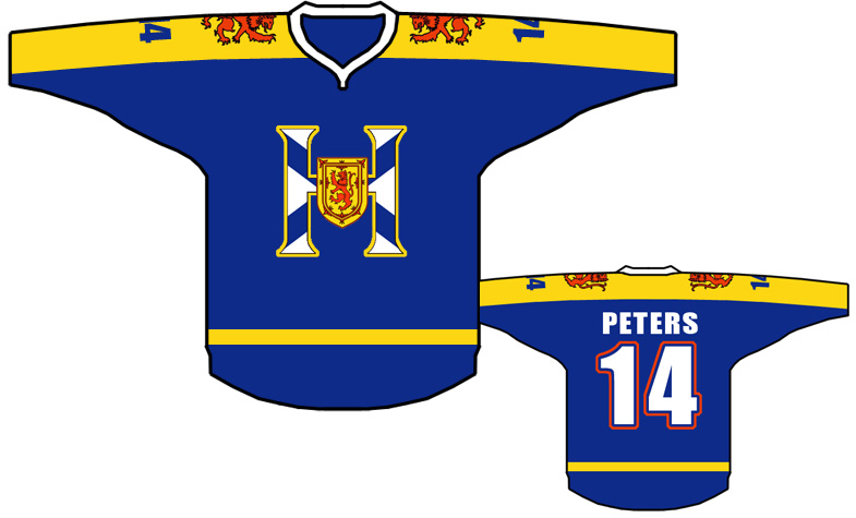 Hoozahs: Blue Home Jersey 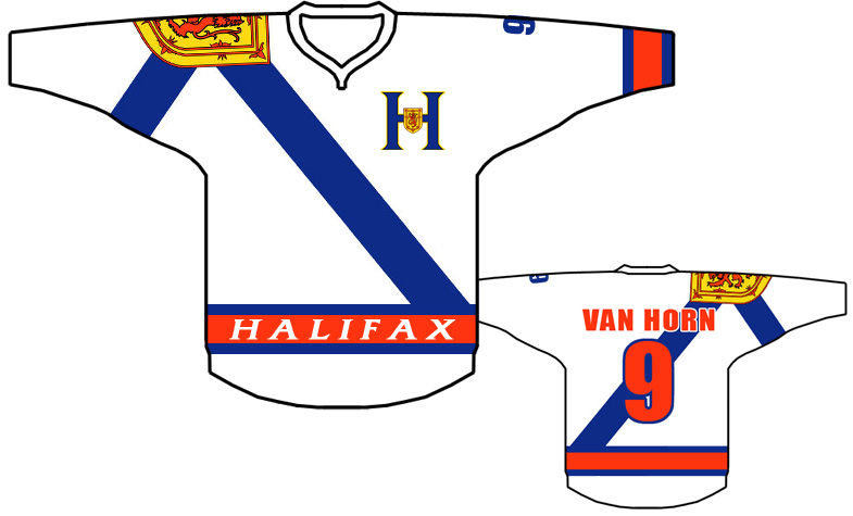 Hoozahs: White Away Jersey 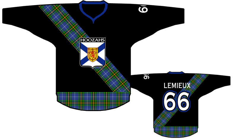 Hoozahs Alternate: Black 3rd Jersey
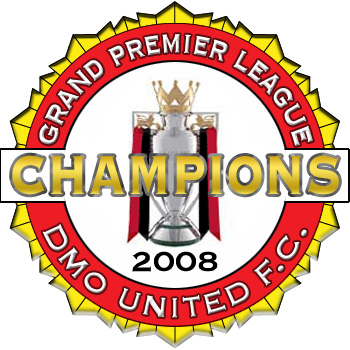
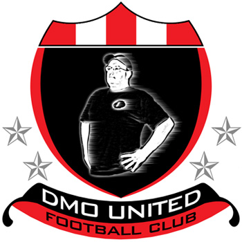
Designer's Notes: This design is one where I had a base (me from the branding of my website at that time) and just meandered my way through a design. No rhyme or reason for any of these colors or design elements, I just went with the flow. On one hand, this is actually a very serviceable mark. On the other hand, I could probably do better. 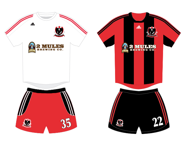 DMO United FC: White home jersey and Red & Black away jersey
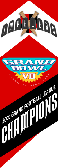
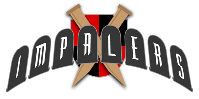
Designer's Notes: Simply put, the name Impalers was my wife's idea. However, I didn't listen to her, and the first year of the league, I called the team the 2x4's with a wood beam for a helmet logo. The next season, I heeded my wife's inspiration and Impalers arose from ashes of that first season. Coincidentally, the new logo also features wood, and the new helmet has a single wooden stake as an homage to the original logo.
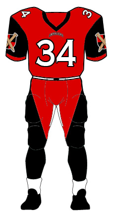
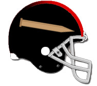 Impalers: Helmet design The home jersey is simply enough with a red body and black sleeves, but the pants were a conscious design move. When combined with the top, it's supposed to look like a stake. Not 100% sure that's aged particularly well in the last 15 years. The away white jersey also features purposeful design choices with the oversized logo on the left shoulder, and the red running down the right sleeve, and the rightmost quarter of the jersey and pant. The asymmetrical style, coupled with the the Impaler identity, this look should imply certain nefarious intentions and imagery, and be a bit unsettling. Admittedly, without this backstory, it may come across as just sloppy. C'est le vie. |
 Thanks for visiting. Love, Demosthenes Spiropoulos |